September 05, 2022
Manufacturing need through design – Visit to IKEA
A visit to IKEA Hyderabad reveals how the store manufactures need through design, using experience elements like the Marius stool and showroom layouts.
Finally!!
It was worth the wait.
I had seen the construction of the building for a long time. The branding exercises with the autos were refreshing. All the autos had the IKEA blue. As designers, you understand the value of fonts in design and sometime TYPE is design. But, with IKEA you know it.
Stepping into the theme park It’s been a long time since, I stepped into a theme park – I even forgot the joy and jubiliation when entering one; the last time would have the school excursion to Dizzee world! I felt the same before entering IKEA, Hyderabad. The circular entrance was still closed and maybe they are on pilot mode still. But, you can clearly see a lot of people walking in, not the best of the entrance experience. It was more like entering a manufacturing shop.
After the security check, a poster suggested that you need the app to shop. I tried installing the app in the store believing that’s necessary to buy in IKEA. Nobody around were installing the app. and soon got distracted by the famous ‘Marius’
Marius stool – it greets you right at the start
Why the stool? It’s affordable and you can’t add it to your bag yet. This makes the customer find out the way to buy it. It also forces everyone to understand how to go about exploring the rest in the IKEA big store. At this point, I went to the coworker asking her how to buy the stool? Then, we got the blue trifold leaflet and the showroom map? Experience design!! More about this later
“You can take a photo of the tag. that’s the easiest” – a helpful IKEA co-worker.
Flow chart At first it was not easy to understand how the shopping works. When did you have a guide to shopping handed over to you at the entrance? Shuffling between the shopper I am and the researcher, It was a confusing state. Again, How do I buy things here? Yes, I didn’t read paper in my hand, who does when you are trying to buying something. Everybody is climbing the stairs somewhere. Only when you go there , you realise its a place where you see things that are very different from what you see in you house everyday.
At this point, understand there are different tags and difficult to buy things. No ordinary shopper things about 3 different types of tags and ponders over the shopping experience – but the researcher in me, was very happy!!
Selling the idea
Elaborate room of different sizes furnished with everything a small room can potentially have. This room definitely succeeds in generating a need – and putting the notion that what you have in your house is old wood and is asking for retirement. Getting the user into a different world. Priming has been used for ages in the advertisement world, but IKEA has a new spin to it. It kindles your subconscious and successfully converts every single person who passes the myriad puzzled path into a customer or even an aspirant. There is a urge to buy something, but you can’t get anything in your hands yet. For the impatient, there is a want to move to the place where you can buy something. We ended up picking a rat here. at this point because you only allowed to see and soak into the design
“Priming is a technique whereby exposure to one stimulus influences a response to a subsequent stimulus, without conscious guidance or intention.”
At first, its a bit overwhelming to see a lot of things. Where do you need to go? I asked the coworker, she said just follow the light arrows on the floor. The ‘light arrows’ – why is it not painted on the floor earlier; may be there will be a new path to test later. Why leave a painted mark on the floor – when you can use the light to reflect the light from the top. Everything about the entire experience was thought through and once you got a bit familiar you know what to do.
Again, Marius stool It is popularly known that the marius stool and the chicken balls are the largest sold items in the shop. So, the popular stool which greets you right in the front is also there in the furniture place. Why break the rule and show it there at the start? It might be about surfacing the relevant information and also telling the potential customer that there are things to buy which are really affordable. I got a red stool and it is INR 399 at the start. And makes you figure out how to traverse through the shop
Event at this point, I still can’t pick the stool. Its available in the self serve portal.
There are around 8-9 spaces [list it down ???] that you
Now, there is a pause. you see the restaurant , after a tired 2 hour run – you need to grab something to eat. but, its full. so we decided to move down and to the stage 2. the market place. It’s a normal store with starting with Kitchen items, the price tag and the design will make sure that you pick a lot of things here.
There are lots of things here. starting with 1,2,3,4,… [put the order here]
wander before going to the stage 2. Market place.
Self-serve experience
And then finally, the EXPERIENCE of the self-serve area, where you pick you furniture. At this point, you have to ponder over you camera images and find which ones you want to fininalize to pick. Location, Rack – yes. its really simple, there are close to 33 racks. Now you realize that its very easy and the entire journey makes clear sense.
And you wonder how can you picks something way up in the top; its easy. you don’t . everything is within your reach. rest of the place you would realize is used for storage.
Questions and answers? What would be like if there was no – showroom and you went into the market place directly? You will never realize what you don’t have. But, all showroom’s try to recreate this but IKEA take it to a different level.
Will IKEA have a online app? They have an app that has all the products, there are plenty of delivery service out there which can deliver the flat packs. Why won’t it be an online superstore. If that happens, that we will buy only the few things that we want. Why would you get a Marius stool when you have the old stool that has been in the home of the last 20 years and still is strong.
Online order
“You will only buy what you want in Online – the scope of me buying more increases with offline shopping” Parkavi
Overall, IKEA is an Experience; It ould be interesting to find out when IKEA moved from furniture store to an experience. DId they look at data; was it a insight from a research deck or was it was a sudden random thought which culminated into what it is today – THE IKEA EXPERIENCE
There are lots of things that builds the IKEA experience, use of paper to jot down the shopping list, 1 metre measuring tape which is available at few places which you use to find if the furniture would fit you house, finding the rack in the self serve area, in case you change your mind, you can leave the stuff just before you go for billing.
And finally,
Ice cream at the end – Yes, you don’t get 10 INR yogurts anymore. But, in IKEA you do. After all the walking around, this is a welcome relief and yes, it’s full
Finally, why did I write about this? Design. Research..
Experience design makes you wonder how many designers worked on this project. The light arrows, the Marius stool at the storuy, the ad outside showing the chicken balls outside Ikea, the light arrows that can be positioned at whim by altering the frame that reflects. The road inside that’s ideal for uber pick ups. – everything unfolded like a well written screen play.
And the, yellow bag – I missed this one, there is a place where you drop the yellow bags before the marketplace and pick up a trolley.
[Uber screenshot]
Will I use the app to make the list next time? I want to..
Notes: Somethings which needs more digging https://about.ikea.com/en/life-at-home/how-we-work/democratic-design Democratic Design
More Articles
See More
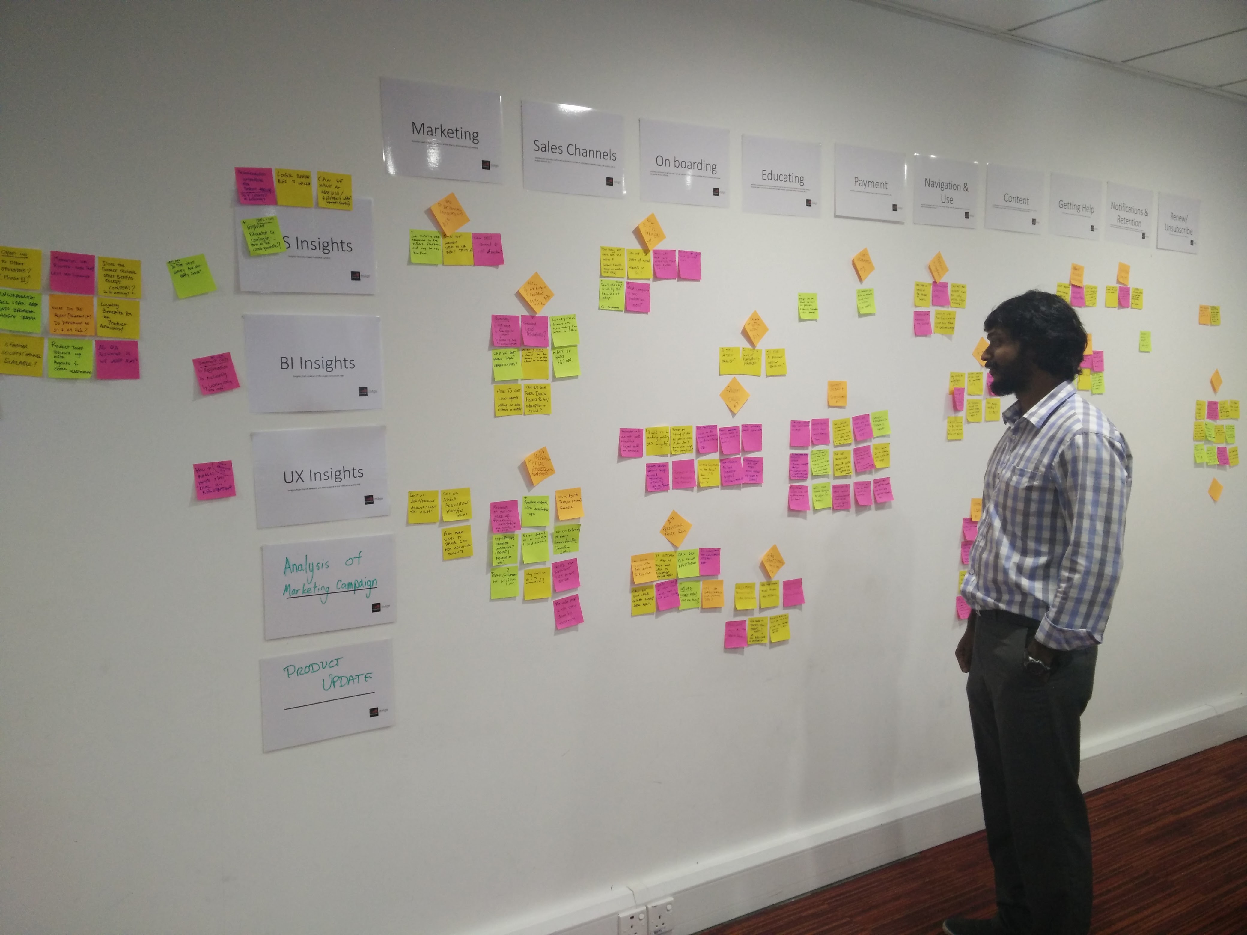
Is User Journey the most powerful service design tool?
User journey mapping is a powerful service design tool that connects team silos, incorporates field research, and ensures iterative product development.
See More

Future of TV
A reflection on watching sports through the Star Sports app and how a single feature can define the entire viewing experience.
See More

We’ve Seen This Before: Reflections on Designing Today
A 20-year reflection on how design tools, roles, and processes have evolved—from Corel Draw to AI-driven prototyping—while emphasizing that fundamentals, collaboration, and problem framing remain constant.
See More

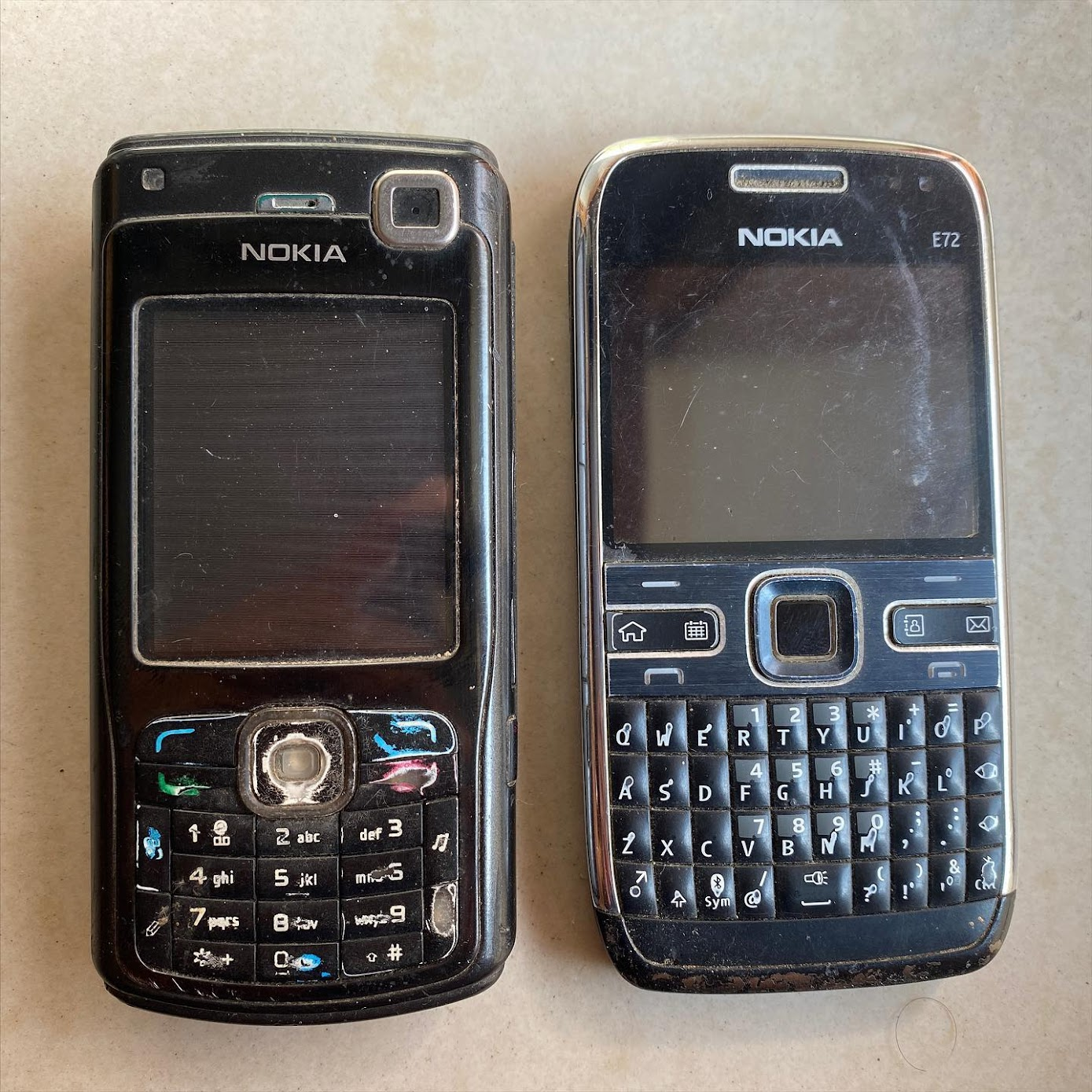
Remembering 176 x 208
A reflection on watching sports through the Star Sports app and how a single feature can define the entire viewing experience.
See More